Not all maple syrup is created equal.
DELIVERABLES
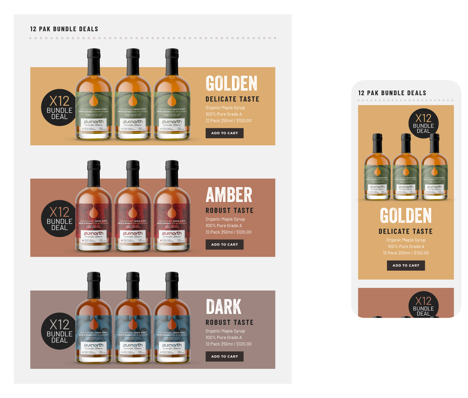
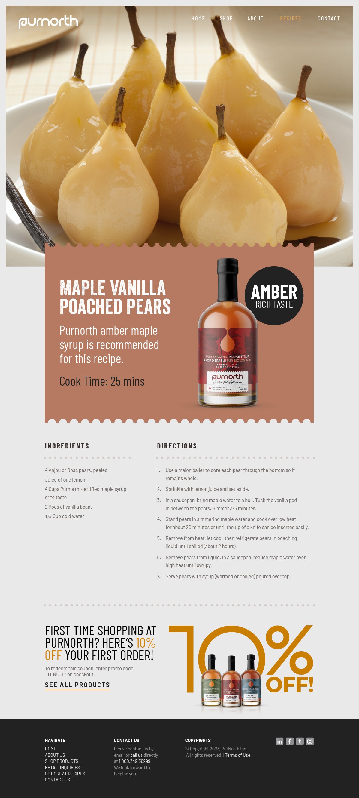
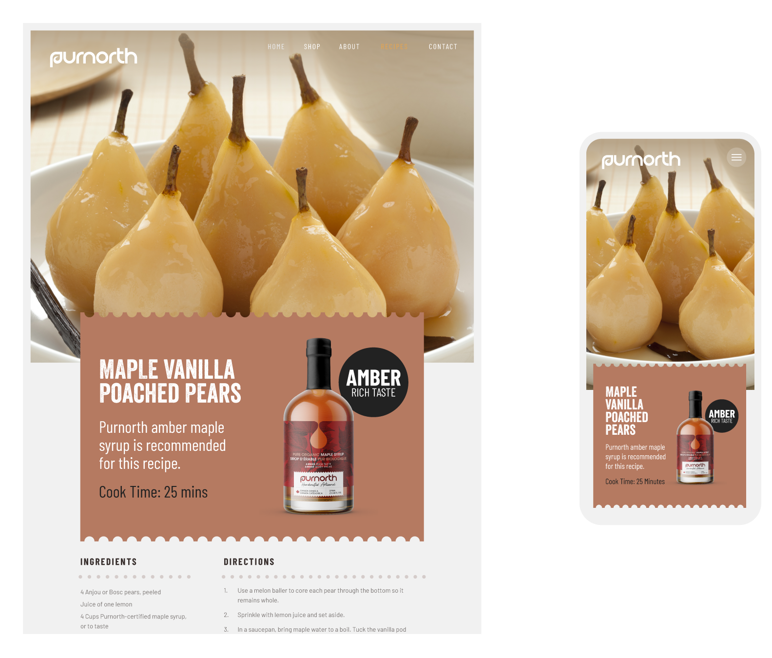
Brand Identity, Concept Creative Direction, Product Development, Packaging, Digital, Collateral.
CLIENT
Purnorth Naturals
OVERVIEW
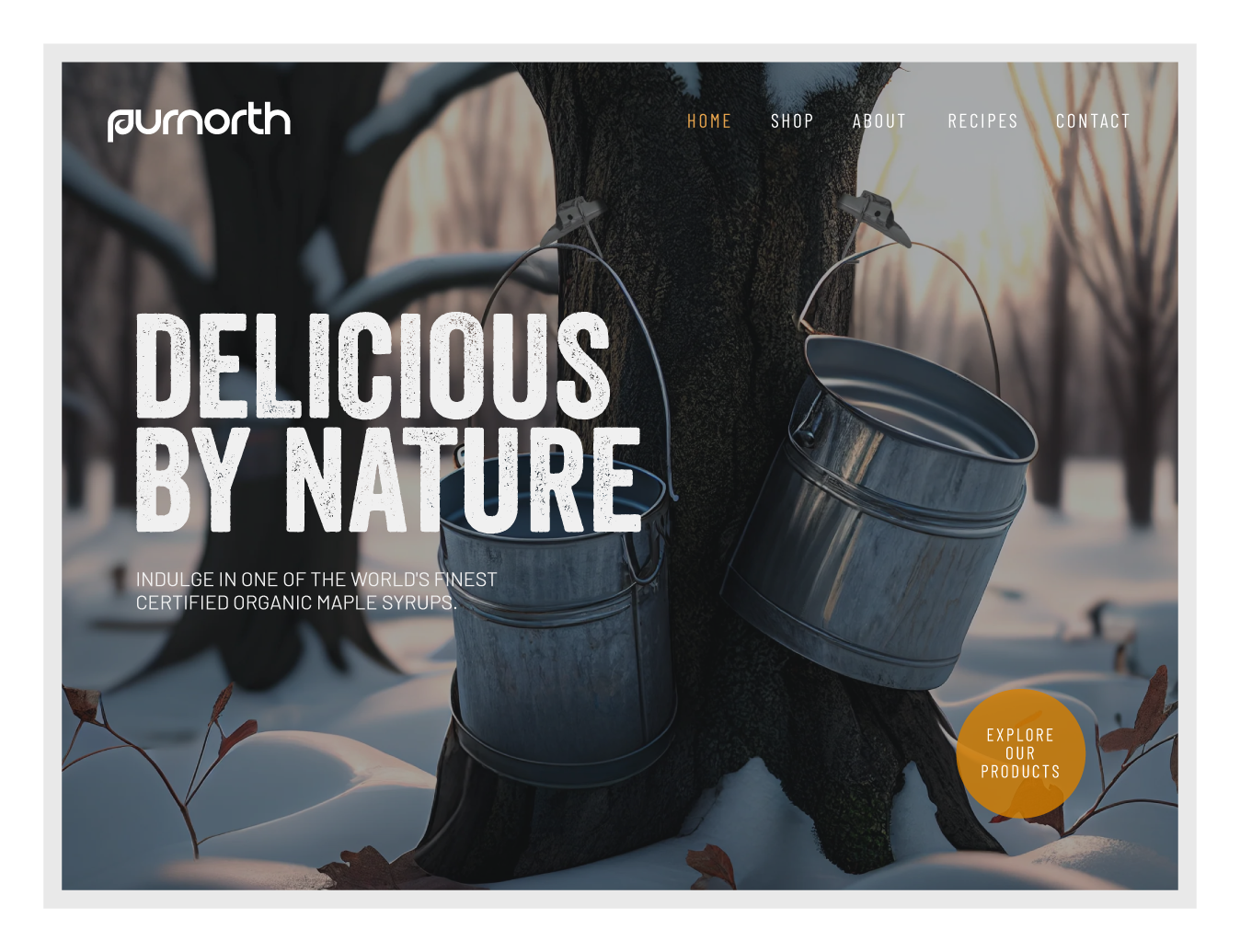
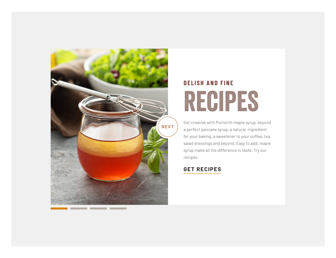
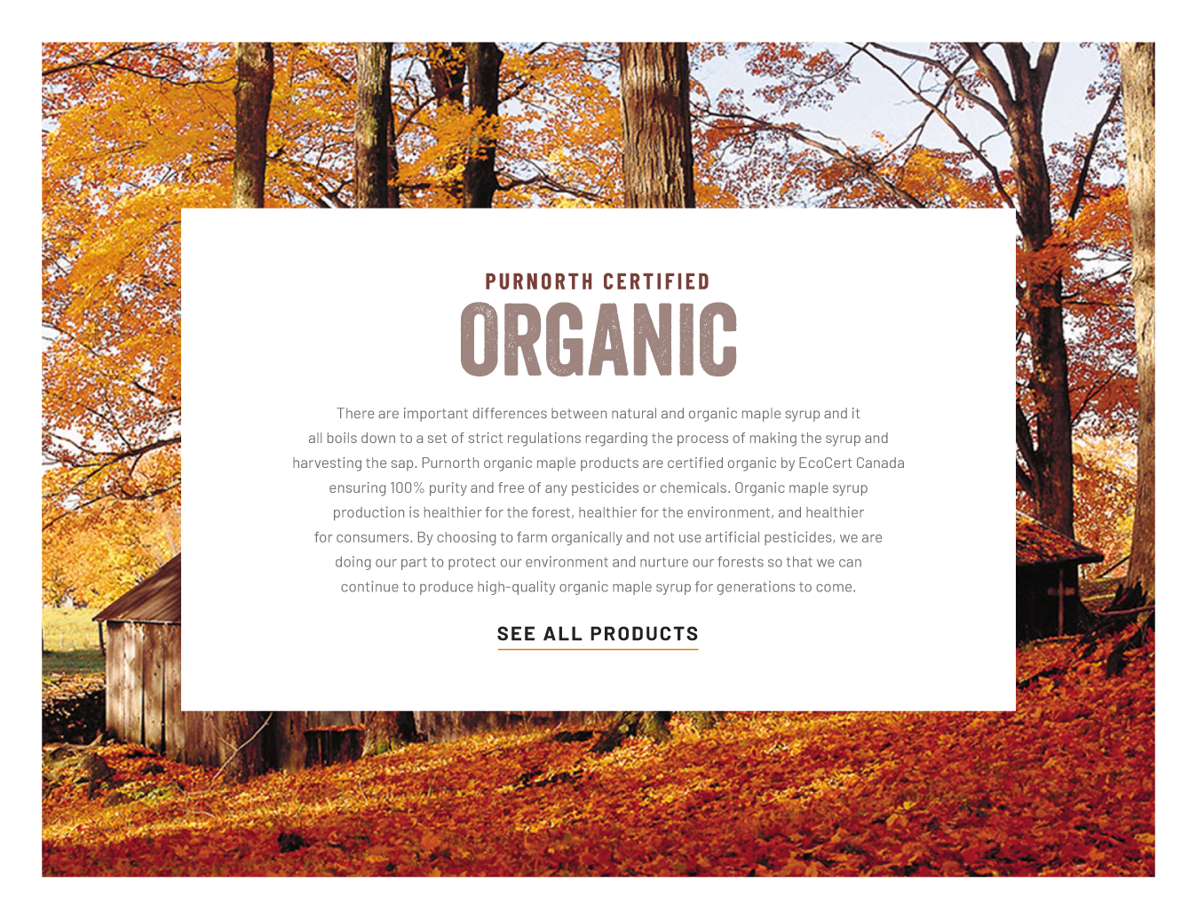
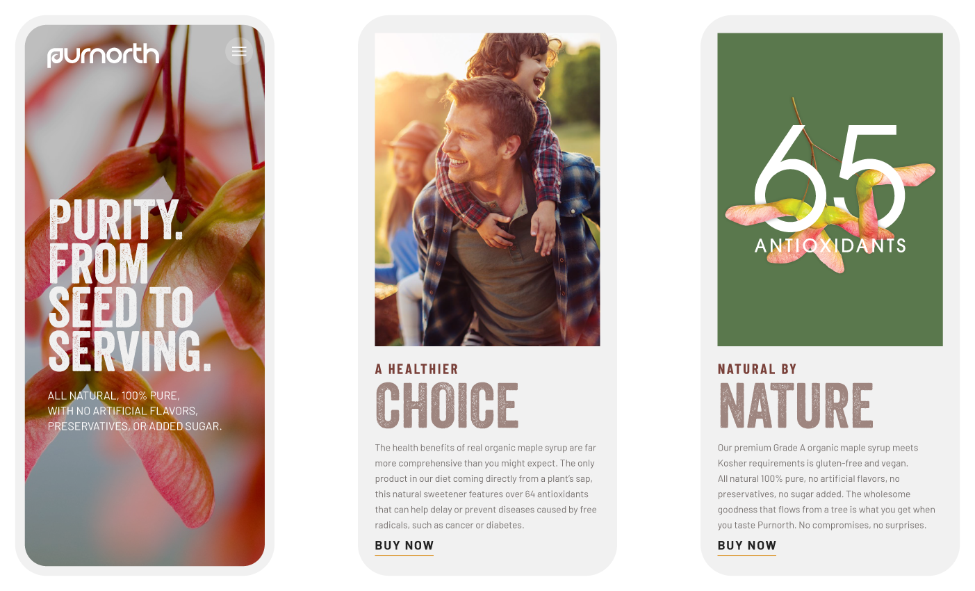
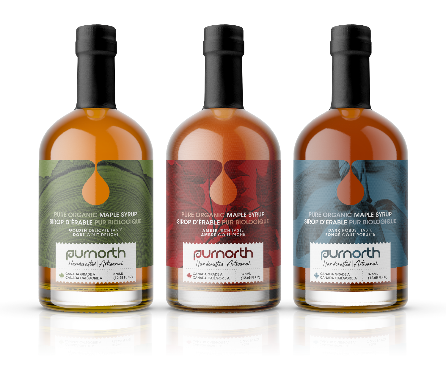
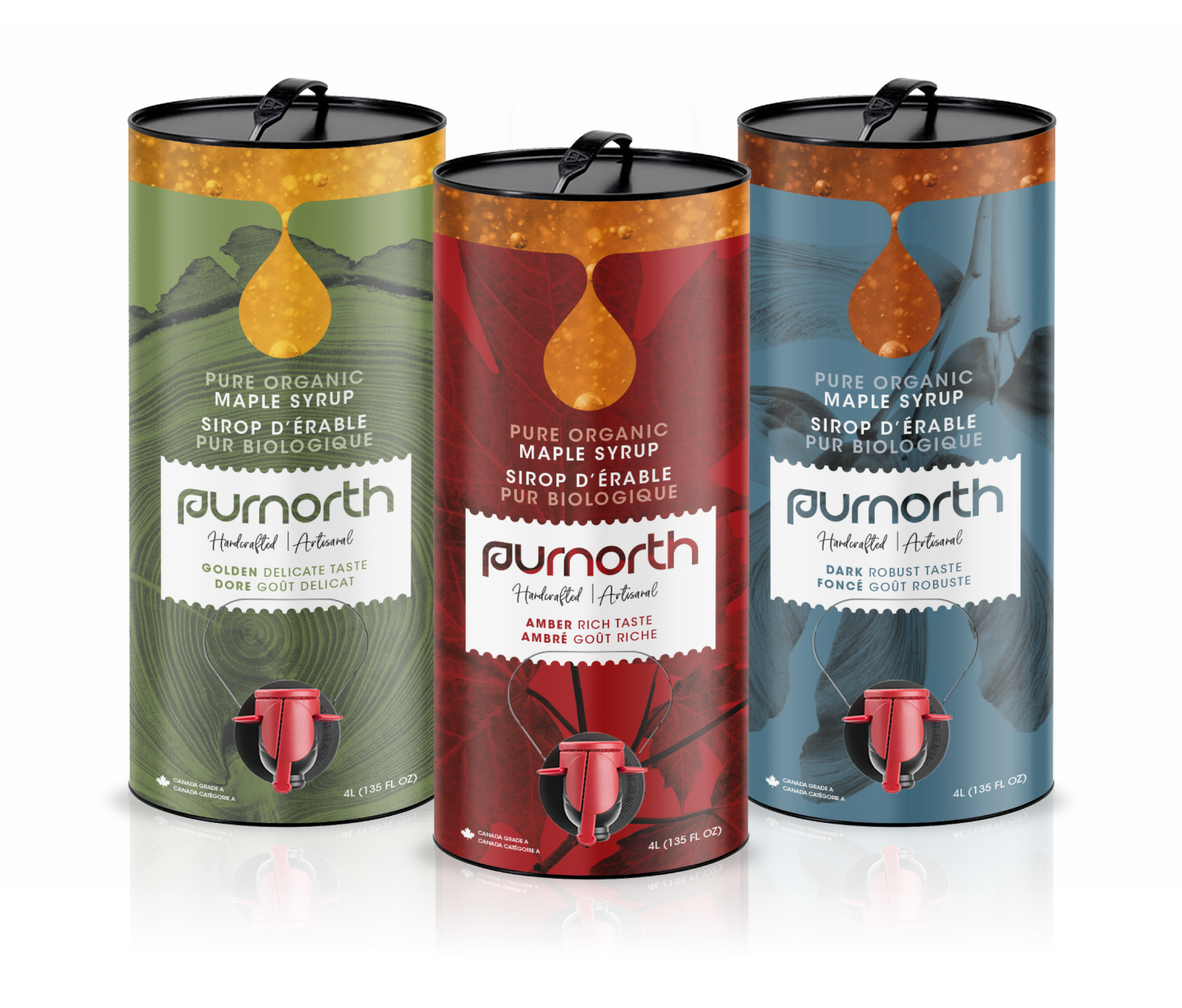
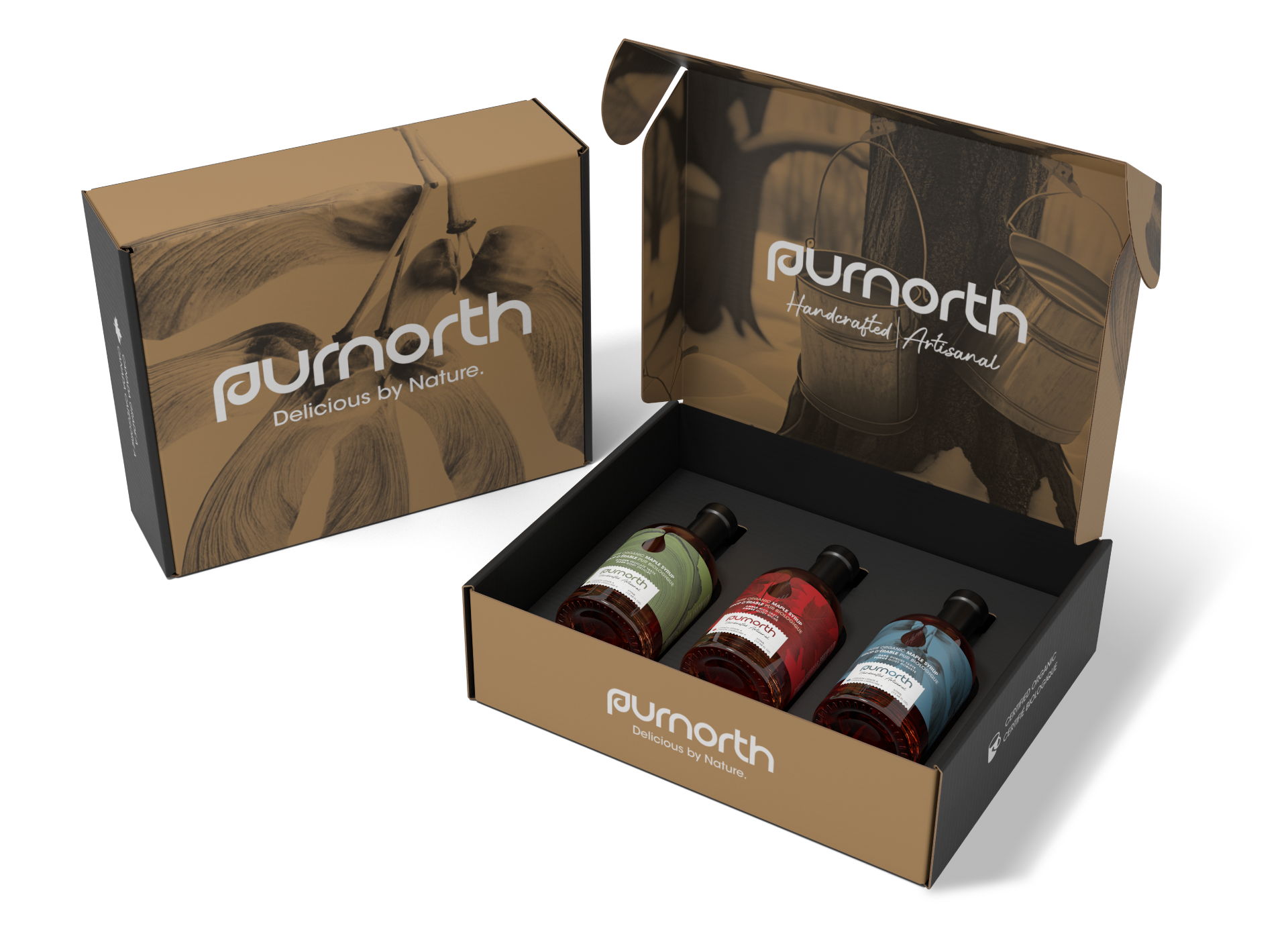
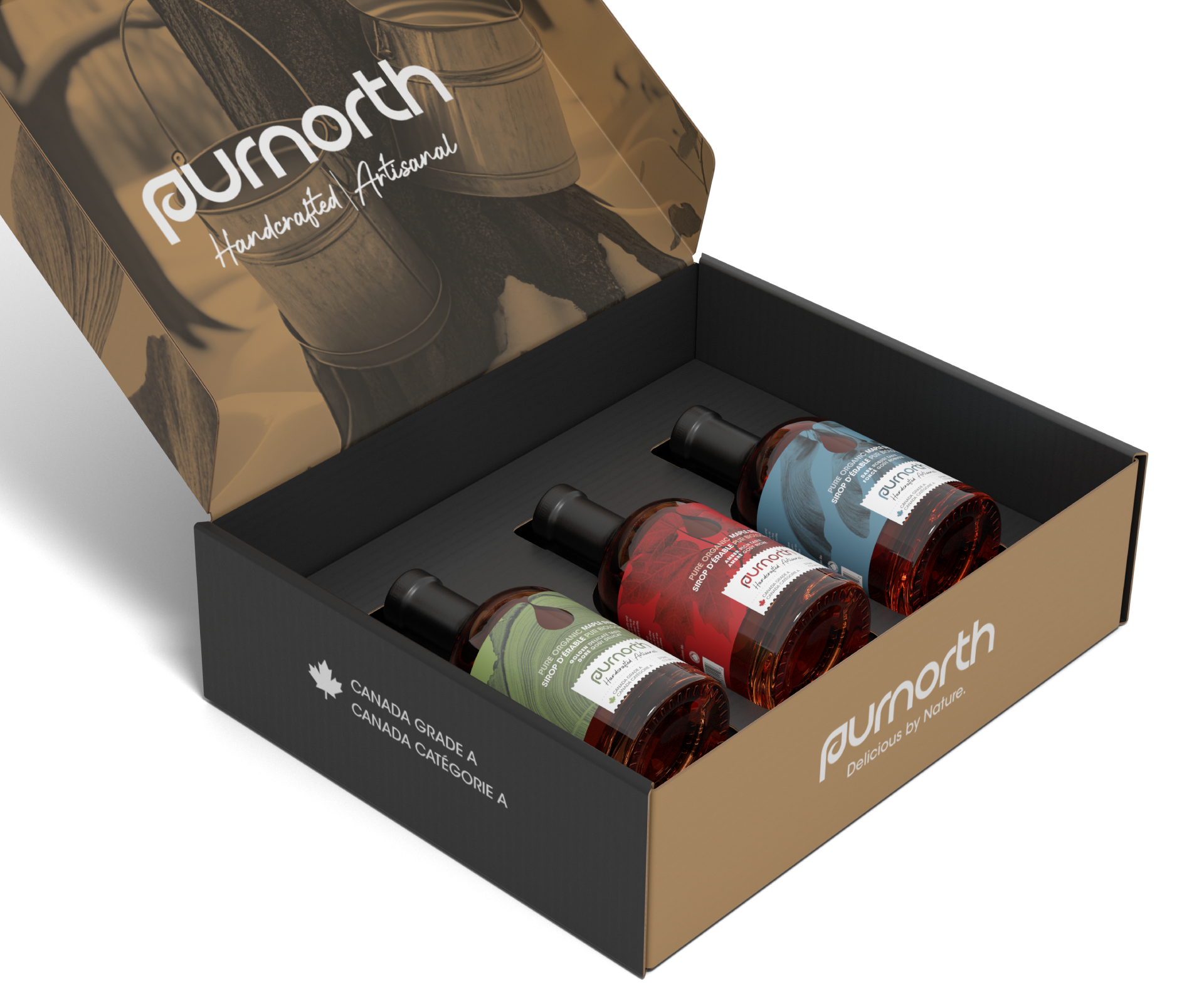
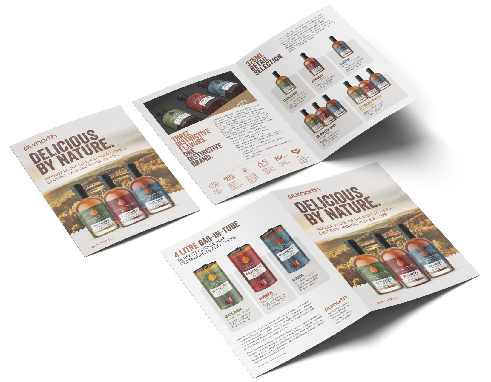
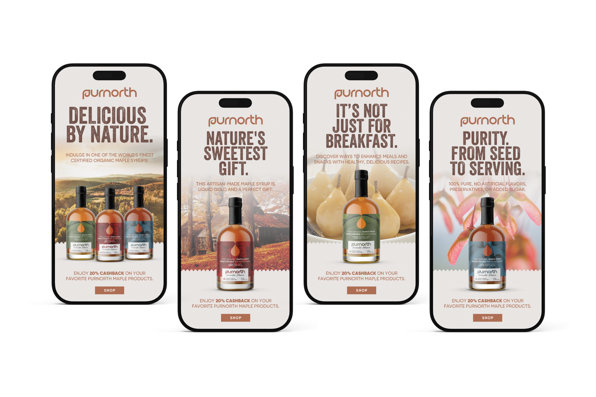
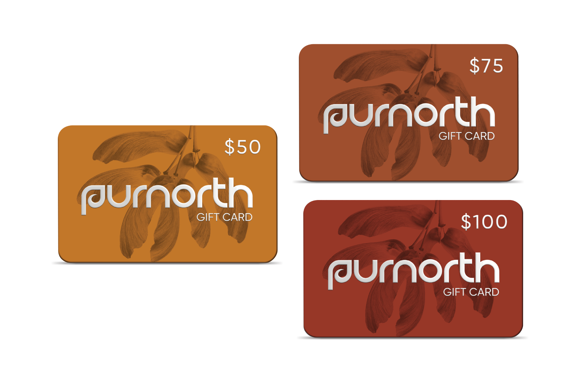
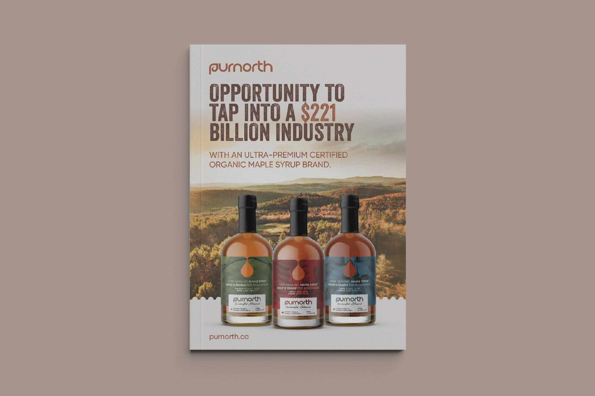
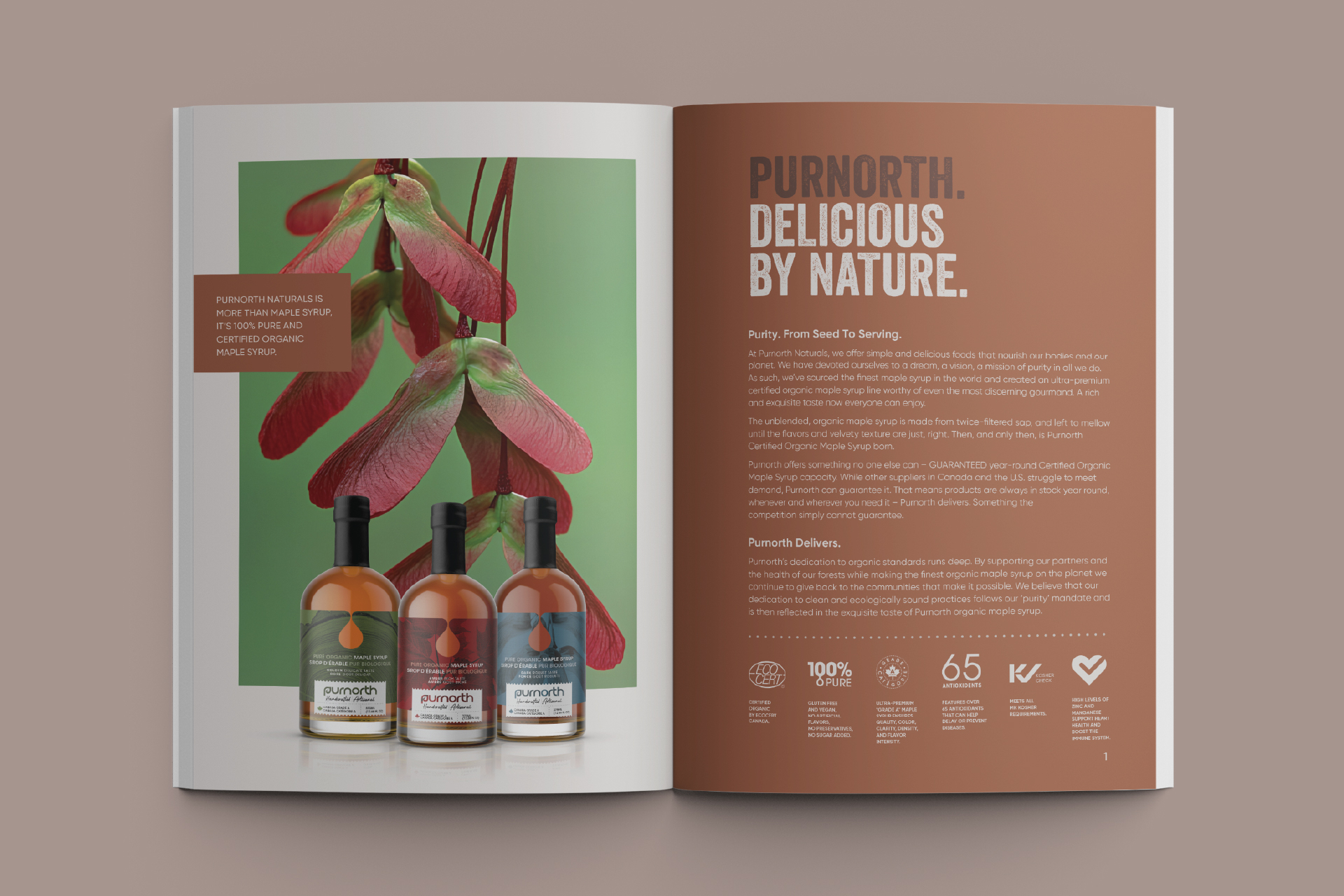
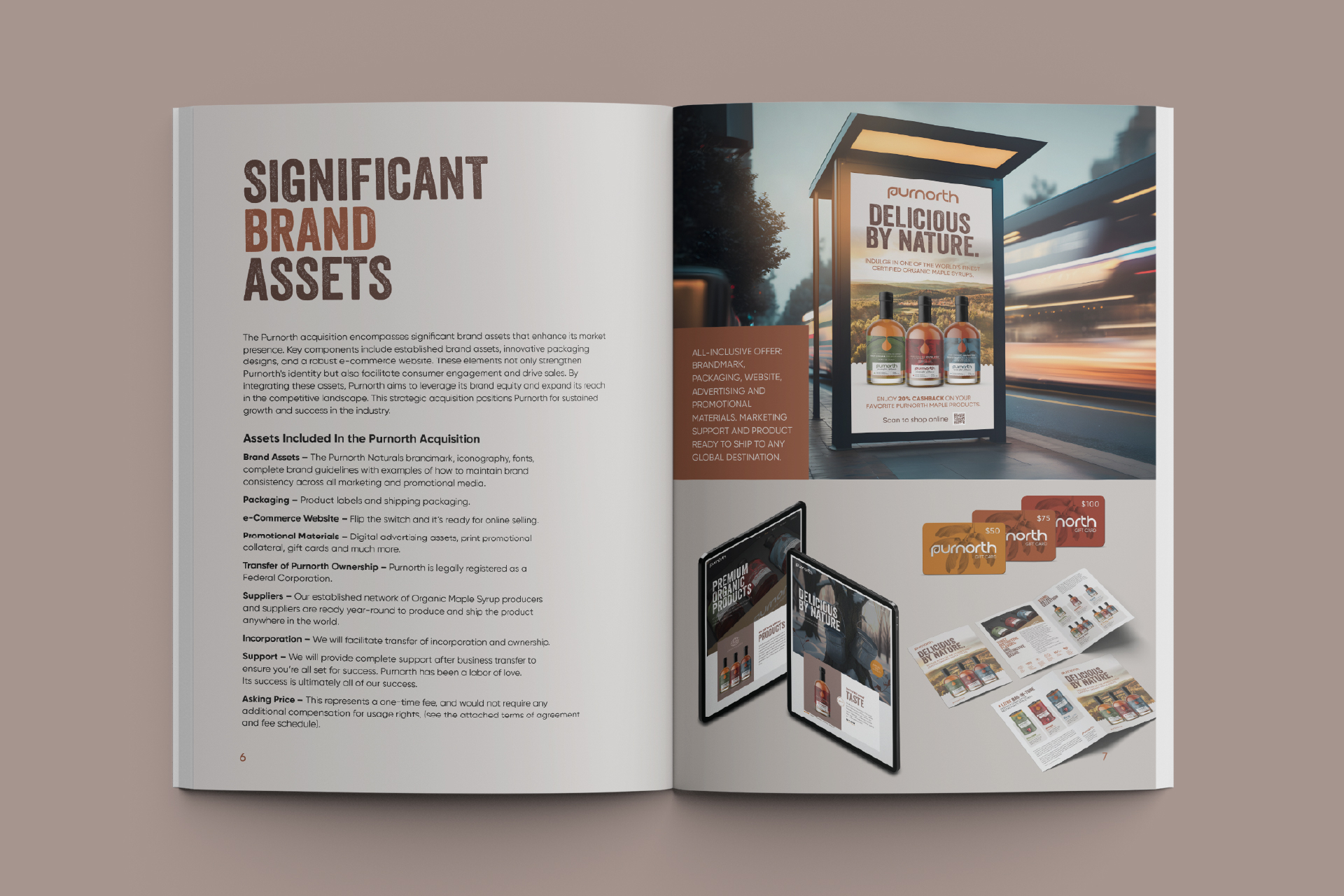
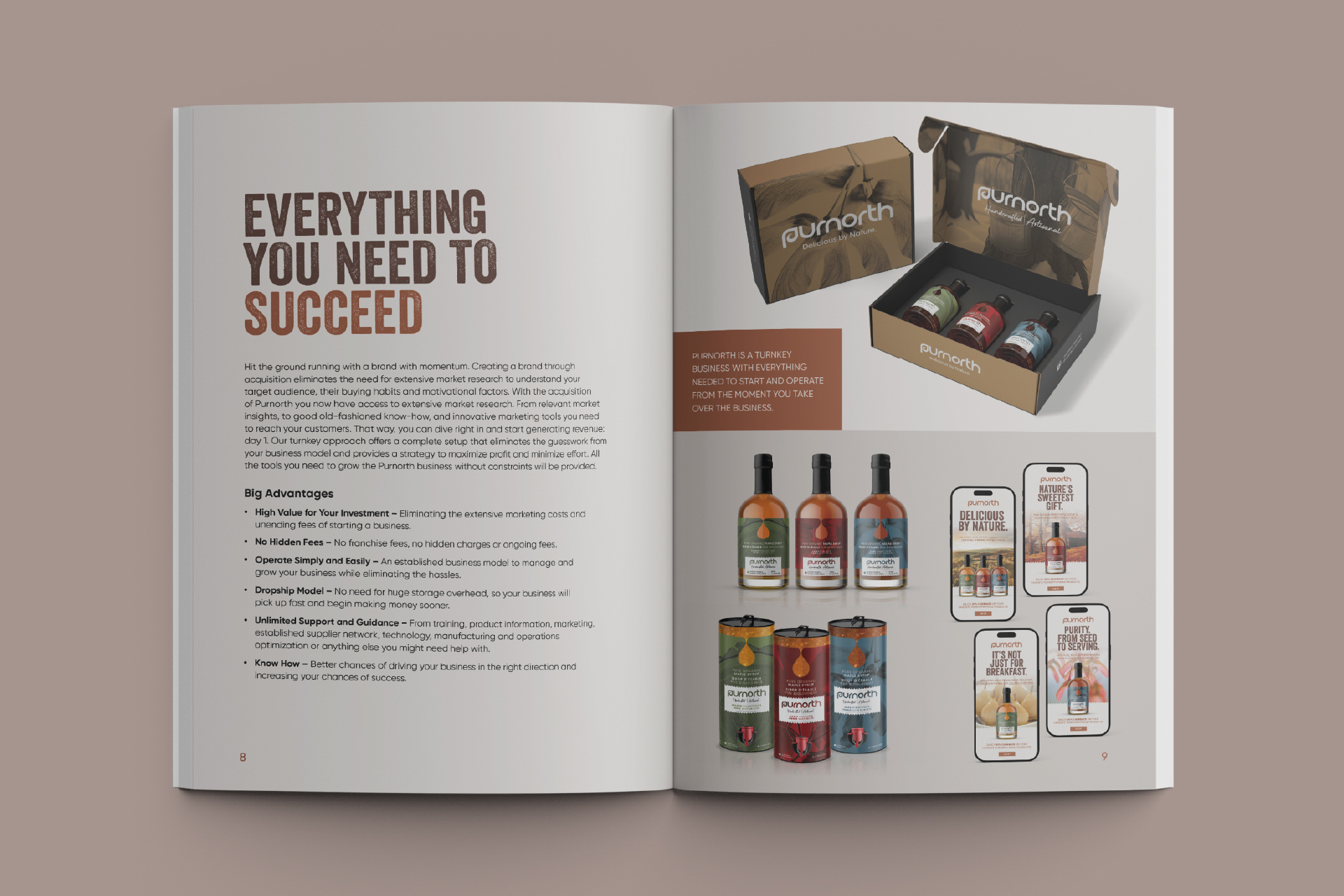
From tree to bottle, the art of crafting maple syrup is a meticulous science that requires both fervor and precision. Purnorth was conceived as an in-house brand for I-D Foods Canada, with the ambition to create an ultra-premium organic maple syrup that could compete with numerous organic offerings in the marketplace. We sourced our syrup from a company committed to ecologically sound practices, resulting in one of the finest organic maple syrups on the globe, celebrated for its exceptional flavor profile. The Purnorth brand name is a fusion of two words: “Pure” and “North,” which encapsulates its essence and resonates with its target audience. The logomark is distinctive and easily recognizable, ensuring that the brand name remains memorable to the public. The identity suite, encompassing imagery and complementary creative elements, is meticulously designed to engage consumers and foster brand acceptance in their minds..

